Andreas Koutsoukos
FIEN

VIPU & TUKISOVELLUS

Clear UI design that helps farmers get through the subsidy application process without getting lost.

Every year, Finnish farmers apply for subsidies online through Vipu, a service run by the Finnish Food Authority. Officials then check those applications in another service called Tukisovellus.

Client / Project
Siili One - Ruokavirasto
Type
Public service
Platform
Web application
Started
2019

From requirements to user experience

I design and build Vipu and Tukisovellus as part of a team. Our goal is that farmers can apply for subsidies with confidence and officials can carry out the checks they need.

Experts and product owners define the requirements and explain what the legislation demands from the service. I take part in those discussions and advise how the requirements can become interfaces that work. I design and document the interface and make changes directly in the front-end code when needed, while the developer handles the application logic.

We work in a multi-vendor environment, in three-week sprints. Every change goes through requirements, UI design, user stories, implementation, testing and review. I develop the products' own interface components and Design System so they stay consistent. I'm part of the renewal from AngularJS to a new Angular architecture, and I help other designers evolve and maintain Design Systems.

One page, many owners, one visual language

Farmers have a farm to run. Applying for subsidies should take as little of their attention as possible, so I designed the homepage around a simple, clear interface.

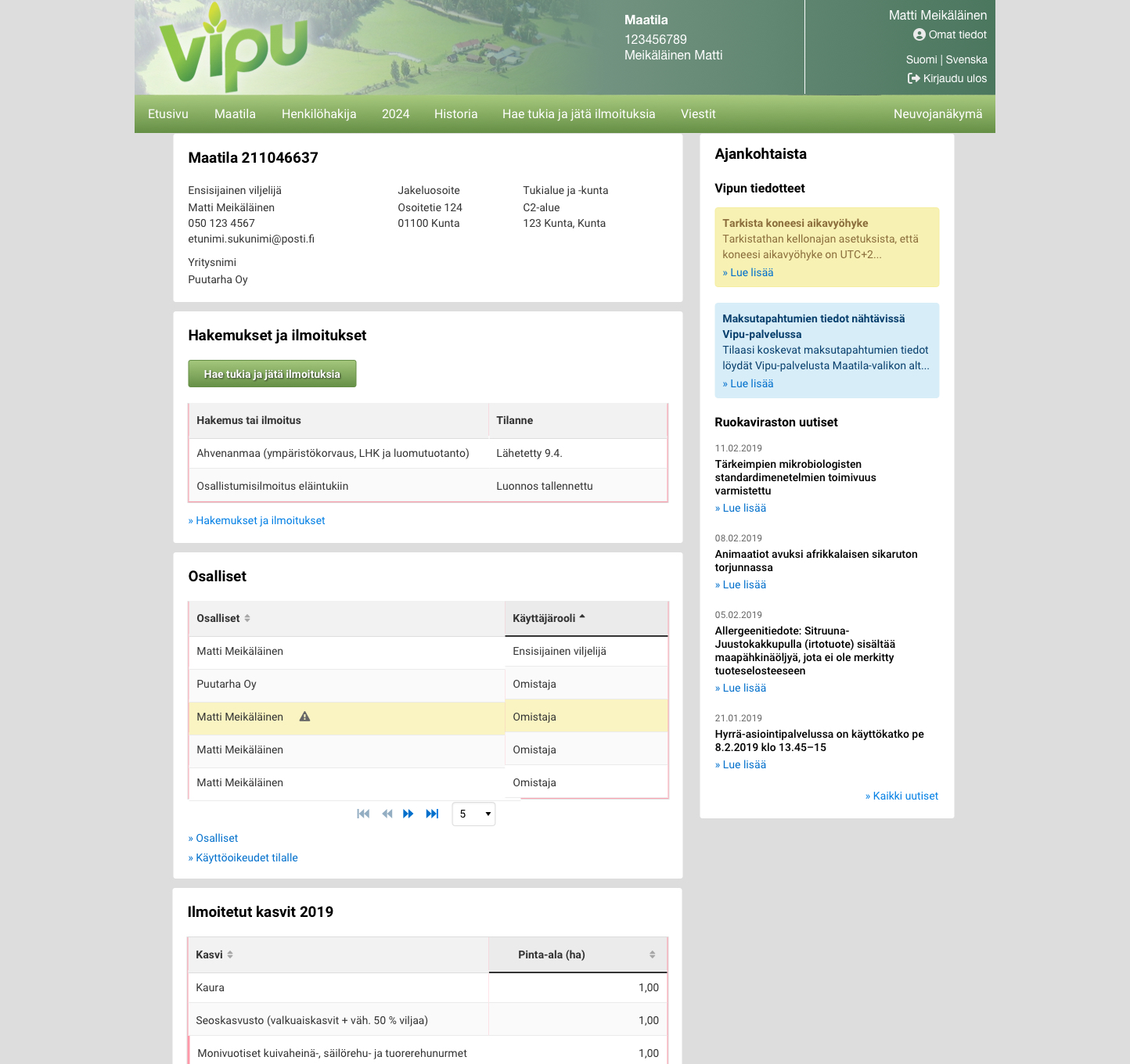
Vipu has a long history. Product owners define its features together with experts, each within their own area, and over the years they have all built on the same page. Without a shared design language, that showed. I made the case to the product owners for each decision below, so the page now speaks one visual language and still feels like Vipu. How that language is built is in section 03.

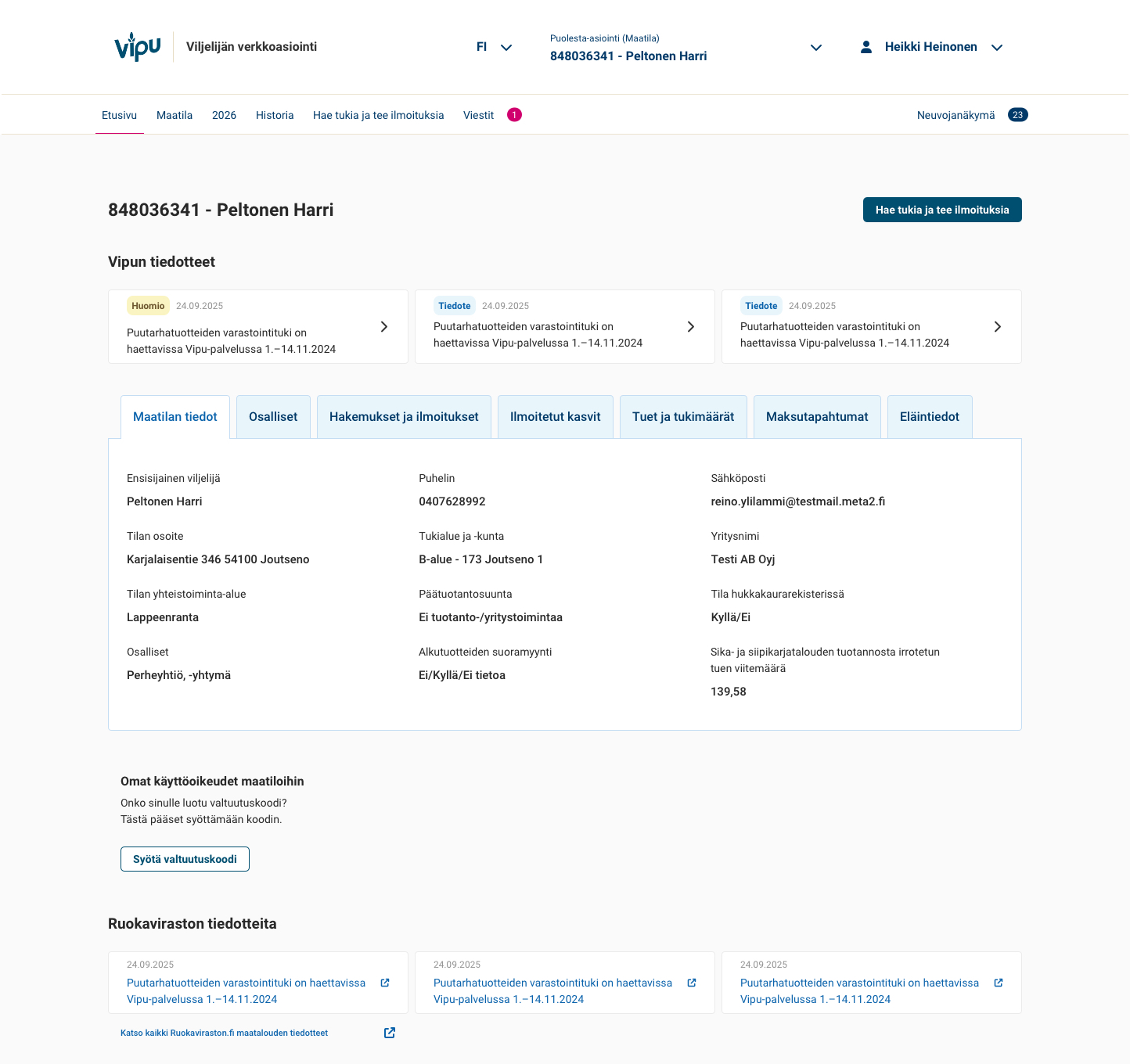
  • Tabs on desktop, accordions on mobile. The old page stacked everything in long, open sections. Now users open only the details they need.
  • A fixed-height content area. It leaves room for important actions, such as managing authorisations.
  • Application buttons always in the same place. Starting an application never means looking for the button.
  • One visual and type hierarchy. Headings, labels and supporting text follow the same logic across the page, so additions from different areas look like they belong together.

The new interface will be released as a whole in the December release. Ahead of it, marketing, experts and farmers have already given positive feedback on its clarity. Its impact in everyday use will be evaluated after the release.

Previous Vipu homepage with farm details, applications, participants and crop information displayed in stacked open sections.Before
New Vipu desktop homepage with information grouped into tabs and farm details selected.After

02 · One menu instead of two

Navigation · Context switching

Choose yourself, a farm or an organisation

Problem

Users selected a farm under Maatila and acted as an individual through Henkilöhakija. Organisation applicants had a separate Yhteisöhakija navigation item. Returning to the personal applicant view required explicitly ending acting on behalf of another party. Switching views meant knowing which route to take.

Solution

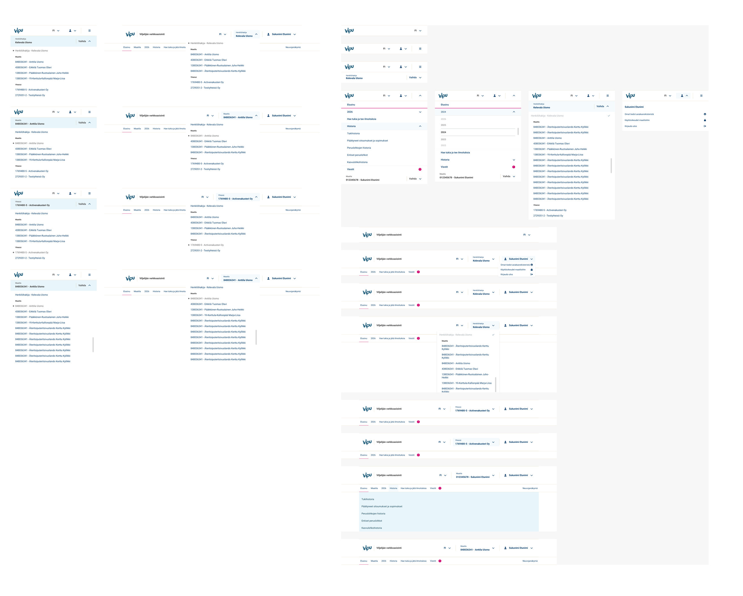
I brought personal, farm and organisation contexts into one grouped selector. Whether users act as an individual, for a farm or for an organisation, the experience stays consistent across their access rights. The current context is clearly displayed, so users can see who they are acting for.
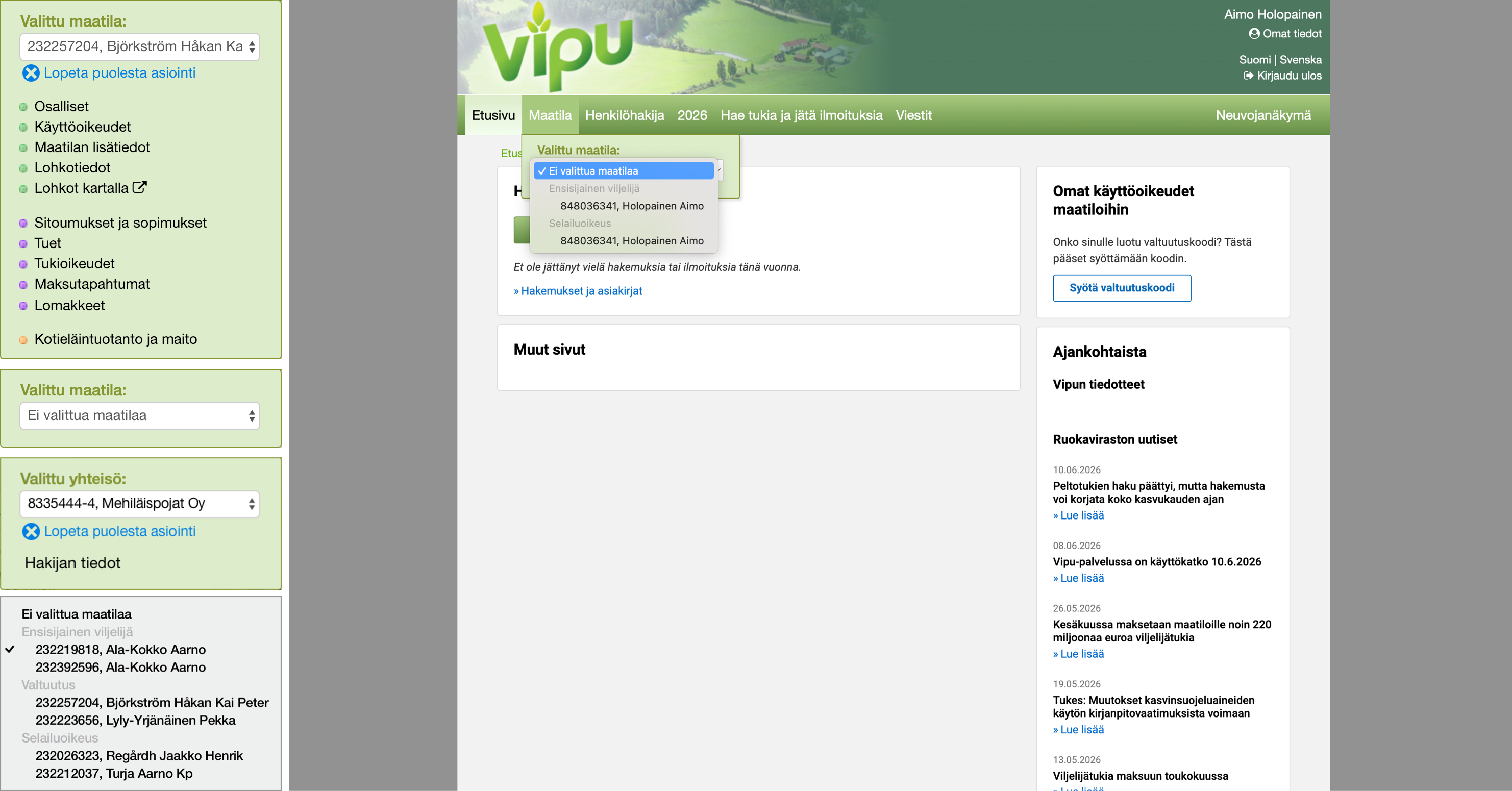
Old Vipu interface showing the farm menu, an organisation selection panel and navigation. The separate Yhteisöhakija navigation item is not visible in this screenshot.
  1. Maatila — farm selection was accessed through the farm menu.
  2. Organisation context — a separate panel showed the selected organisation and the action to end acting on its behalf.
  3. Separate navigation routes — Henkilöhakija opened the personal applicant view. Organisation applicants also had a Yhteisöhakija item, not shown here. Returning to the personal role required “Lopeta puolesta asiointi” (end acting on behalf).
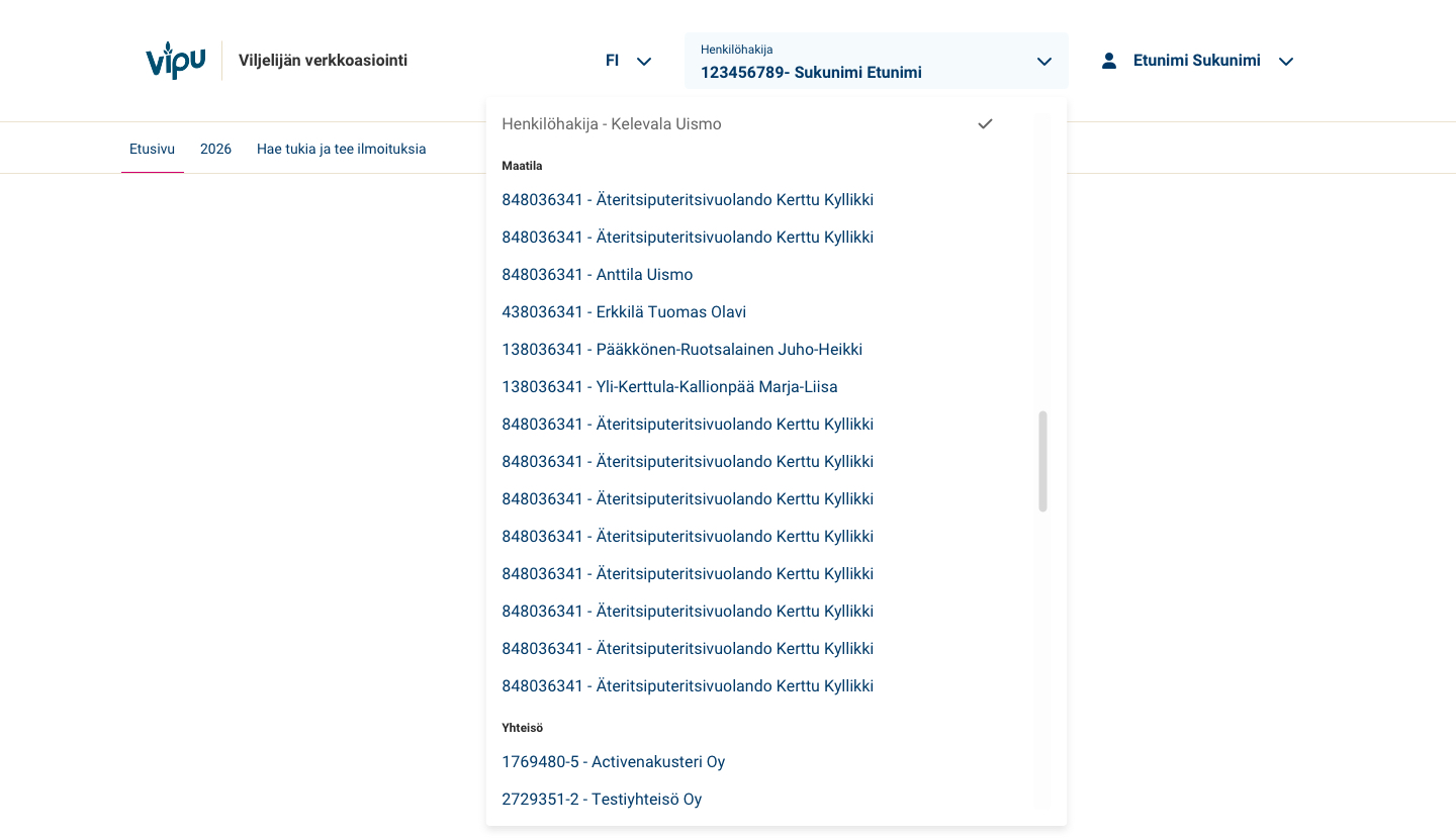
New Vipu selector showing the personal applicant, farms and organisations in one menu, with a checkmark for the current selection.
  1. One consistent experience for personal, farm and organisation contexts, regardless of access rights.
  2. Grouped by personal, farm and organisation.
  3. Clear current context: users can see who they are acting for, and the current choice is also marked in the menu.
  4. Next: search and filtering for users in a supervisory role who have many farms in their list.
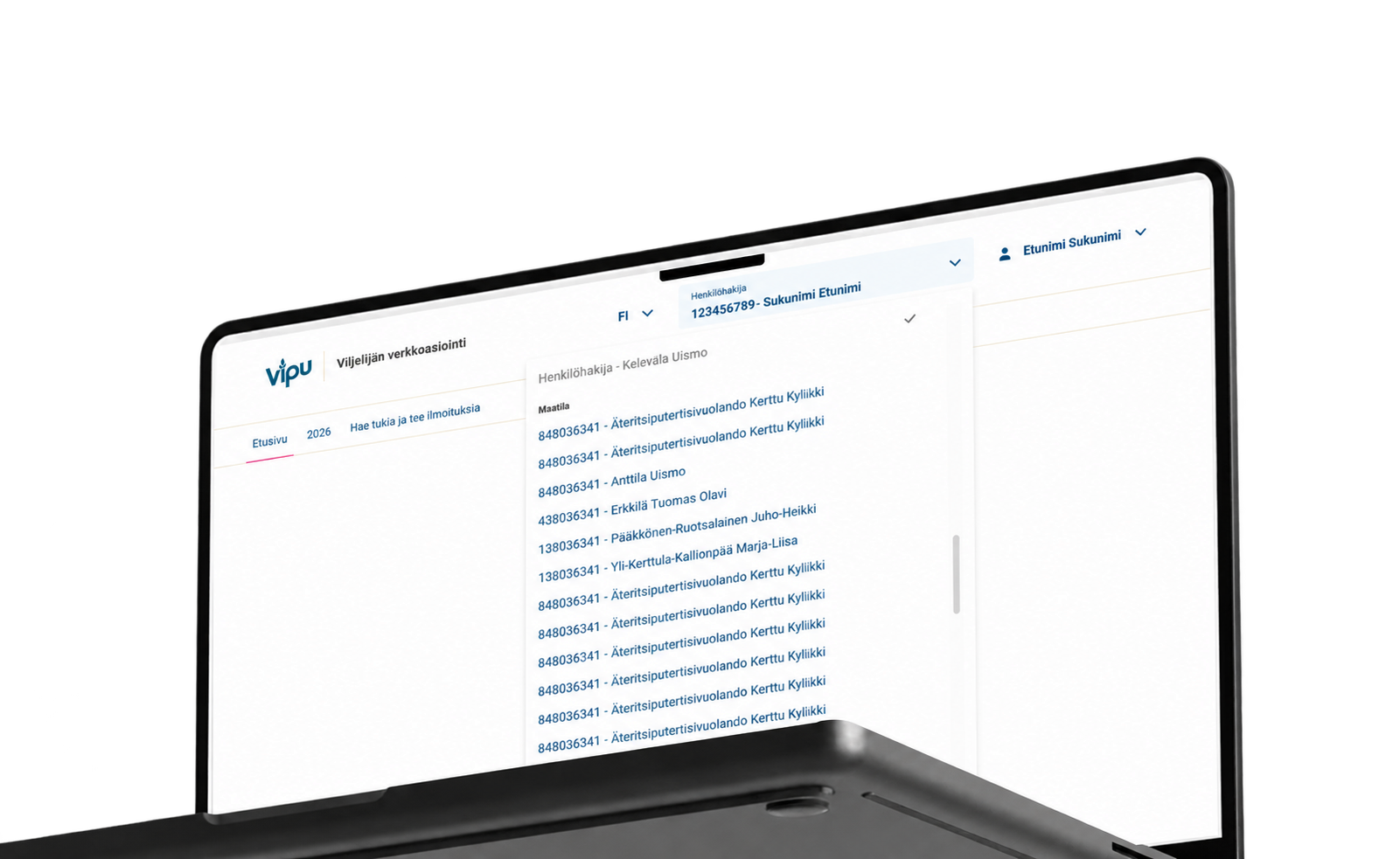
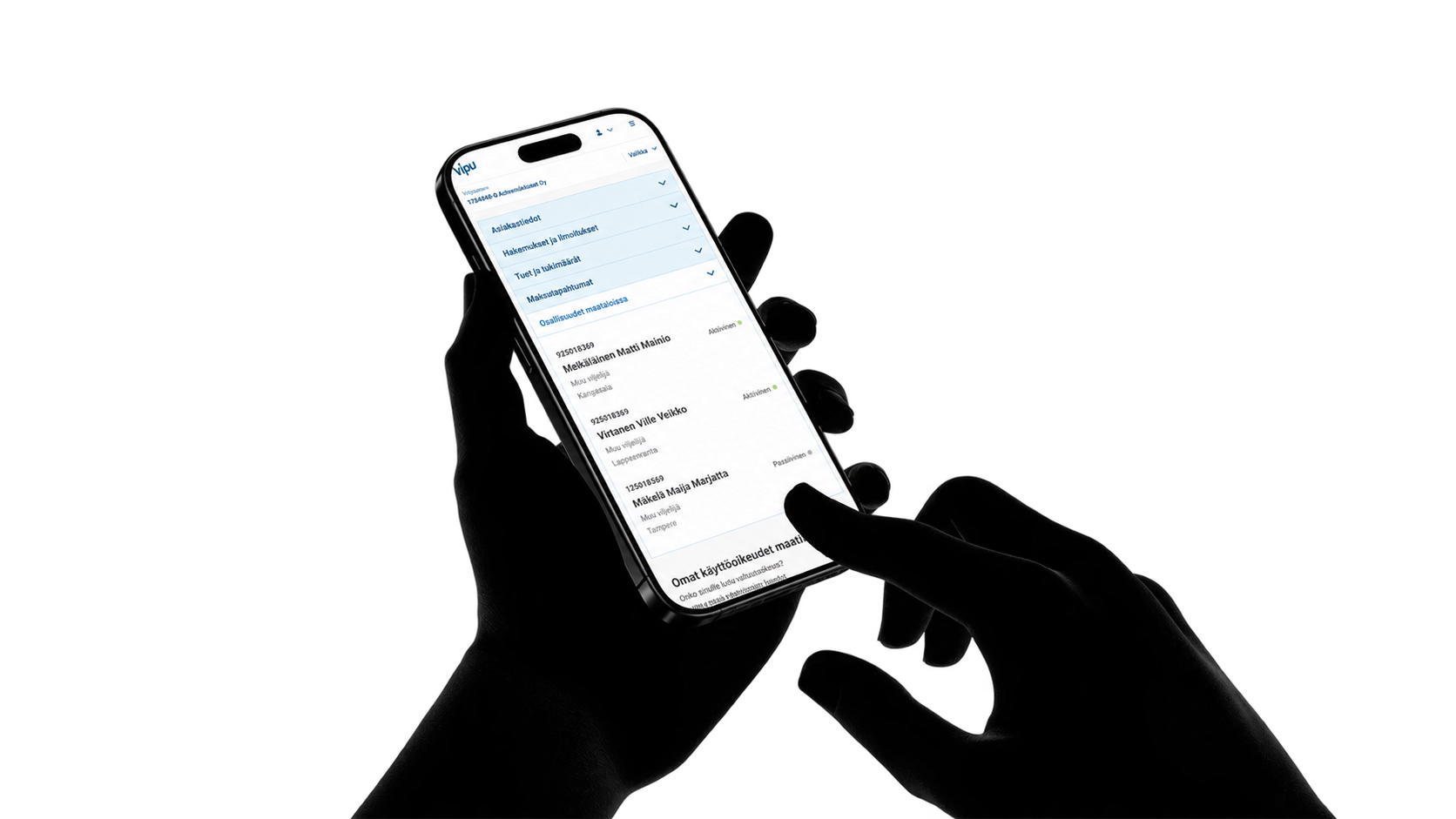
New Vipu desktop selector: personal applicant, farms and organisations in one menu, with a checkmark indicating the current selection.Vipu mobile homepage on a phone, showing accordion sections with farm participation details expanded.

A Design System that keeps evolving

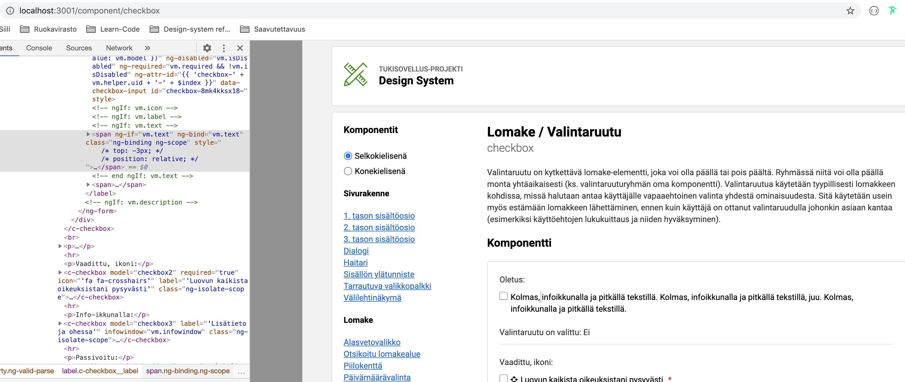
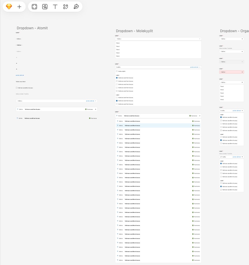
Vipu and Tukisovellus started with a component site for developers that showed HTML elements. Designers had no library of their own, so every full view was drawn from scratch. It took a lot of time and slowed the work down.

We began building reusable components in Sketch, shared the library through Zeplin, and moved version control from Abstract to Sketch's cloud. Over the years I have built Sketch plugins that automate design work and library maintenance. I led the latest step: moving the architecture to atomic design, where components and organisms are encapsulated units built on shared atoms and easy to maintain. We have also weighed moving to Figma, but licensing and security requirements have kept us in Sketch so far.

The Finnish Food Authority's own Design System came later. It serves many services at a general level and is still growing, and its architecture was planned for React while most of the services run on Angular. The team and I decided to use it as our reference and move visually closer to it, without changing what users already recognise. Angular Material was not an option because the services use two or even three Angular architectures, so we build our own components.

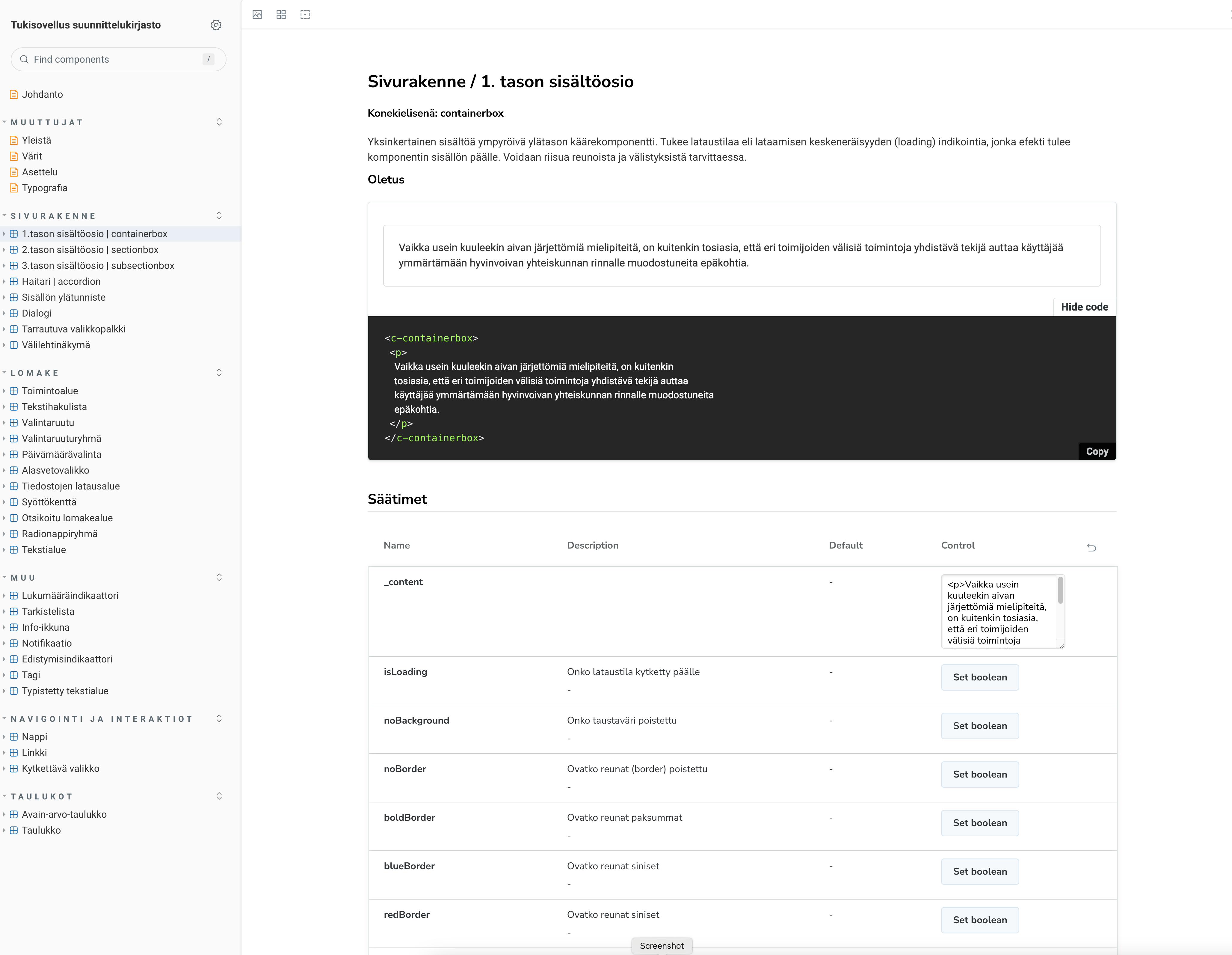
Storybook is in use, and rolling it out to the product owners is still in progress. We are exploring how AI can help with that, so that we no longer need to draw an image of every state for the UI documentation used in testing and implementation.

Designed with the build in mind

Over the years I have learned the different Angular versions and their architecture. So I know how interfaces are built and what is feasible, and I design so that the plan does not change on its way to code. I document the interface and, when it makes sense, make the changes in the front-end code myself. The developer handles the application logic.

I help developers with the fine detail work that often falls between design and development, such as getting spacing and alignment exactly right. That lets them focus on the logic, and the result matches what was drawn.

I want the code and the design to stay close to each other. Understanding the code tests the design: it reveals details that static mockups do not show, and it sparks ideas that go back to the drawing board.

I enjoy working with the people who build. I sit between product owners and developers and translate technical details into terms product owners can act on, so decisions are made knowing what they mean for the build.